I have a confession: the first time I painted a wall terracotta, I paired it with the wrong everything. Cool gray sofa, bright white trim, navy artwork. The room looked like a swatch book threw up — nothing clashed exactly, but nothing sang either. The terracotta itself was beautiful. The pairings were the problem.
This guide is what I wish I had read before that paint went up. Not “100 inspiring terracotta rooms” — you can find those on Pinterest in five seconds. Instead: which specific colors actually pair with terracotta, which ones secretly fight it, and how to build a small palette that feels grown-up rather than themed. I work mostly out of a 1940s bungalow with original oak floors, so I’ll mention how each combination plays with warm wood since that’s probably what you’re working with too.
First, Decide Which Terracotta You’re Working With
“Terracotta” covers about a five-color range — from the dusty pink-salmon of unfinished pots to the deep burnt-orange of glazed Tuscan tile. Pairings that work for a soft, dusty terracotta don’t work for a saturated burnt-orange, and vice versa. Before you start matching, pin down where on this spectrum yours sits. Hold your swatch next to a brown paper bag in natural light: if it reads pink, you’re in dusty territory; if it reads orange, you’re in saturated territory.
Pairing 1: Olive Green (The Reliable One)
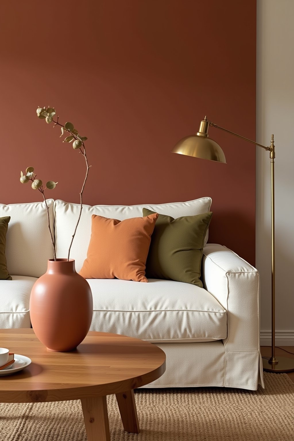
If you only remember one pairing from this guide, make it this. Olive green and terracotta are nature’s palette — both colors are pulled directly from earth and dried herbs, and they read as inevitable together rather than designed. Use olive on a sofa, an accent chair, throw pillows, or framed botanical prints. The trick is choosing an olive that has some yellow in it (think dried sage, not forest) so it stays on the warm side of the spectrum. Cool olive can drift toward gray-green and read flat against terracotta.
Two olive paint colors I’ve tested and would use again: Farrow & Ball Bancha and Sherwin-Williams Artichoke. Bancha is moodier and works in low-light rooms; Artichoke is brighter and pairs better with terracotta in sun-flooded spaces.
Pairing 2: Cream (Not White)
This is the one I got wrong the first time. White trim against terracotta walls reads as too high-contrast and almost theatrical — like the room is wearing too much eyeliner. Swap to a warm cream and the whole thing softens. Benjamin Moore White Dove is the classic; Sherwin-Williams Alabaster works similarly. Both have enough yellow to harmonize with terracotta’s warmth without disappearing into it.
Cream applies to more than trim. Linen curtains in cream, a cream slipcovered sofa, cream-colored bedding — all of these let terracotta breathe without going into stark contrast.
Pairing 3: Black (Used Sparingly)
Counterintuitive but it works: a small dose of true black anchors terracotta’s warmth and keeps the room from reading too soft. Think a black-framed mirror, black hardware on cabinets, a black floor lamp, or black-painted picture frames in a gallery wall. The key word is small — black should be punctuation, not a paragraph. A black-painted feature wall in a terracotta room reads aggressive; a black side table reads chic.
Pairing 4: Navy (Carefully)
This is the one I see Pinterest get wrong constantly. Navy and terracotta can be stunning, but only if both are saturated and used in equal-ish proportion. A small navy throw pillow on a terracotta sofa works. A navy accent wall behind a terracotta accent chair works. What doesn’t work: half-hearted navy — navy curtains on a terracotta wall when nothing else in the room references either color. Without a third anchor, the eye keeps bouncing between the two and the room feels unsettled.
If you go this route, add a third color to break the tension. Brass, cream, or a soft blush all work as referees.
Pairing 5: Brass and Aged Bronze (Always Yes)
Metals matter more than people credit. Chrome and brushed nickel fight terracotta — they read cool against its warmth and the contrast feels off. Brass, aged bronze, and even a warm matte black all amplify terracotta’s richness. Swap your light fixture, cabinet pulls, and curtain rods to one of these warm metals before you commit to any other pairing — you’ll be surprised how much that single change unifies a room.
Three Pairings to Skip
Cool gray. The combination most likely to make a terracotta room feel dated. Cool gray drains terracotta of its warmth and leaves it looking dirty. If you have existing cool-gray furniture, layer warm cream and olive on top to bridge the gap, but don’t add more.
Hot pink. Tempting on a mood board, exhausting in a real room. The two warm tones compete rather than complement. If you want pink with terracotta, drop to a dusty mauve or blush.
Pure mustard yellow. Both colors share a lot of the same undertones, which sounds like it should work but actually means the room reads monotone. Better choice: ochre or a darker honey shade with more depth.
Building a Three-Color Palette
Here are three palettes I’ve used successfully in actual rooms, in case you want a starting point rather than building from scratch.
Mediterranean modern: Terracotta + cream + olive. Add brass hardware. Works for living rooms, dining rooms, kitchens.
Earthy maximalist: Terracotta + black + ochre. Add aged bronze. Works for libraries, bedrooms, dens with a lot of pattern.
Soft and sun-washed: Dusty terracotta + cream + sage green. Add unlacquered brass. Works for bedrooms, nurseries, sun-room reading nooks.
A Note on Wood Tones
Terracotta plays well with most wood tones except cool, blonde modern wood (the kind you’d see in a 2018 Scandinavian-inspired build). Warm oak, walnut, cherry, and even orange-toned mid-century teak all sing with terracotta. If you’ve got cool blonde wood, layer a vintage rug or a warm-toned coffee table on top to mediate.
FAQ
Does terracotta work in a small room? Yes, but go softer (dusty terracotta) rather than saturated. Saturated terracotta in a small room with poor light can read closing-in.
Can I use terracotta with existing cool-toned furniture? You can, but you’ll need to add layers (rugs, curtains, throw pillows) in warm cream and olive to bridge the temperature gap. Otherwise the cool furniture will fight the warm wall.
What sheen of paint works best for terracotta walls? Eggshell or matte. Anything glossier reads like a hotel lobby. Matte is more forgiving on walls that aren’t perfectly smooth.