Why Floating Shelves Look Amazing in Magazines — And Messy in Real Life
Floating shelves are one of the most popular home decor projects out there. They’re affordable, easy to install, and look incredible in every Pinterest photo you’ve ever saved. But here’s the frustrating reality most people discover: once you actually mount them and start placing things on them, they look nothing like the photos. Instead of curated and intentional, they look cluttered, random, and somehow always a little off.
The difference between styled shelves and stuffed shelves isn’t the shelves themselves — it’s the approach. Designers follow a few surprisingly simple principles when styling shelves, and once you know them, you’ll never look at a floating shelf the same way again. Whether you have one shelf above a desk or an entire wall of them, this guide will help you style them with confidence.
Start With the Right Shelves (Material and Size Matter)
Before you start styling, make sure your shelves are working for you, not against you. The most common mistake is choosing shelves that are too shallow or too narrow for what you want to display. A standard floating shelf should be at least 8 inches deep — anything less and you’re limited to flat objects leaning against the wall.
For material, solid wood shelves in natural oak, walnut, or white-stained pine look the most elevated. A Solid Wood Floating Shelf in Natural Oak Finish gives you a warm, organic base that works with almost any decor style. If you prefer a more modern look, matte black metal shelves or white lacquer shelves create clean lines — but avoid anything that looks flimsy or bows under weight.
For spacing, mount shelves 10 to 12 inches apart if you’re stacking multiples. This gives each shelf enough vertical room to display taller objects without everything feeling cramped. If you’re doing a single statement shelf, mount it at eye level — roughly 60 inches from the floor — for maximum visual impact.
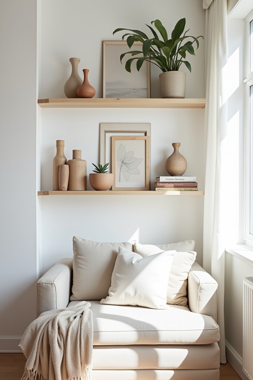
The Rule of Three: Grouping Objects That Look Right Together
Designers constantly use the rule of three: group items in odd numbers, especially threes. Odd-numbered groupings feel dynamic and visually interesting, while even numbers feel static and predictable. When you place three objects together on a shelf, your eye naturally moves between them, creating a sense of flow.
Each group of three should include variation in height, shape, and texture. For example: a tall ceramic vase, a small potted succulent, and a stack of two or three books. Or: a framed photo leaning against the wall, a candle in a brass holder, and a small sculptural object. The tallest item anchors the group, the medium item provides balance, and the smallest adds detail.
A Set of Decorative Ceramic Vases in Mixed Heights is one of the easiest ways to nail this principle. You get three pieces that already work together but provide the height variation you need. Place them at one end of a shelf, add a plant at the other end, and you’ve instantly created a designer-level arrangement.
Layer and Lean: Adding Depth Without Adding Clutter
One of the biggest differences between amateur and professional shelf styling is depth. Beginners place everything flat against the wall in a single row. Designers layer objects front-to-back, creating visual depth that makes the shelf feel curated rather than displayed.
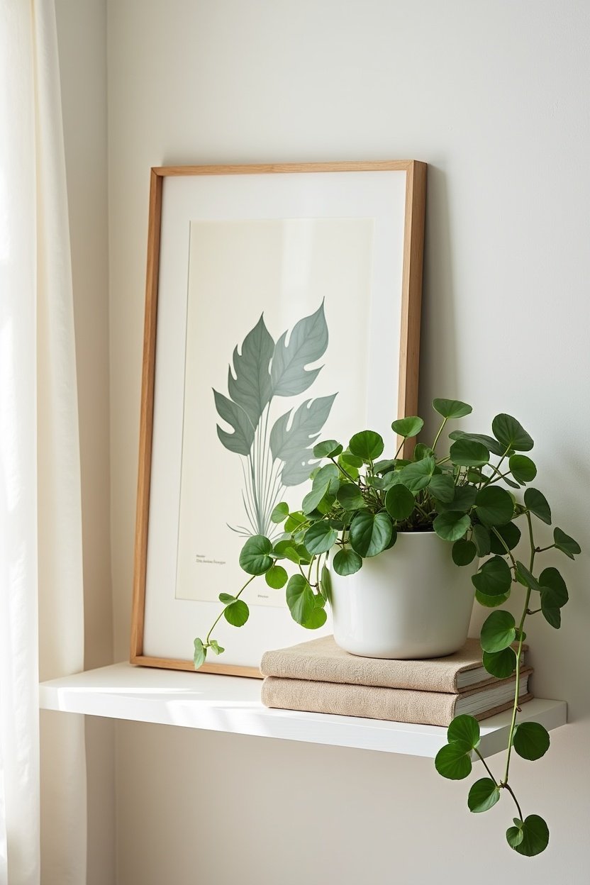
The easiest layering technique is the lean. Take a framed print or small piece of art and lean it against the wall at the back of the shelf. Then place smaller objects in front of it — a small plant, a candle, a decorative box. The leaning frame creates a backdrop that ties the smaller objects together and fills the vertical space behind them.
Books are another powerful layering tool. Stack two or three horizontally to create a platform, then place a small object on top — a tiny plant in a ceramic pot, a decorative sphere, or a small clock. This technique adds height variation without needing tall objects and makes practical items like books feel intentional rather than stored.
Don’t be afraid to overlap slightly. A trailing plant that drapes over the edge of a shelf, partially obscuring the objects below, creates a natural, lived-in feel that perfectly styled shelves sometimes lack. A Trailing Pothos Plant in a Ceramic Hanging Pot is ideal for this — it adds life and movement while softening the hard lines of the shelf.
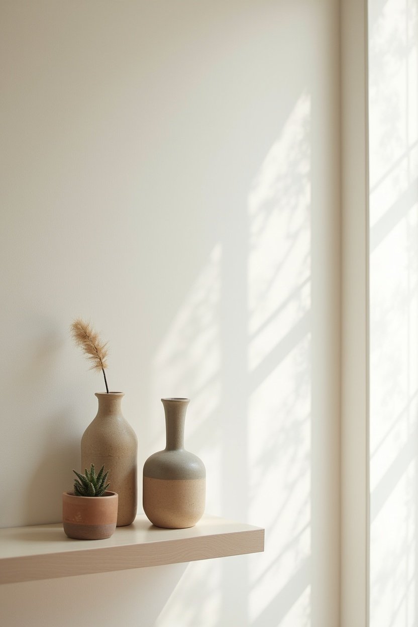
The Negative Space Secret: What You Leave Empty Matters
Here’s the most counterintuitive shelf styling tip: the empty space is just as important as the filled space. If every inch of your shelf is covered, the eye has nowhere to rest and the overall effect reads as cluttered, no matter how beautiful each individual object is.
Aim to leave about 30 to 40 percent of each shelf empty. This doesn’t mean leaving entire shelves bare (unless you’re going for an ultra-minimalist look). It means leaving breathing room between groupings. If you have a group of three objects on the left side of a shelf, leave a gap before placing a single object or small grouping on the right side.
On a wall of multiple shelves, vary where you place your groupings. Don’t center everything — offset your arrangements so that a grouping on the upper-left shelf is balanced by objects on the lower-right shelf. This diagonal flow creates movement and keeps the eye engaged across the entire display.
Color and Material: Creating a Cohesive Palette
The fastest way to make floating shelves look polished is to limit your color palette. Choose two or three colors and one metallic accent, then stick to them across all your shelves. For example: white, natural wood, and black with brass accents. Or: soft sage green, cream, and warm walnut with copper touches.
Material repetition is equally important. If you have a ceramic vase on one shelf, echo that ceramic material on another shelf with a different ceramic piece. If you use a woven basket on one shelf, add a woven placemat or textile element elsewhere. This creates visual cohesion — the shelves feel like they belong to the same story rather than being random collections of objects.
Books are a secret weapon for color cohesion. Turn books spine-in (pages facing out) for a uniform neutral look, or curate books with spines that match your color palette. A stack of books in coordinating colors looks intentional and pulled together in a way that a rainbow of random spines doesn’t.
The Five Must-Have Shelf Styling Categories
Every well-styled shelf pulls from these five categories of objects. You don’t need all five on every shelf, but having at least three represented across your display creates the right balance:
- Something organic. Plants, dried flowers, driftwood, a coral piece, or a branch in a vase. Living or natural elements bring warmth and prevent the display from feeling sterile.
- Something with texture. A woven basket, a ceramic piece with interesting glaze, a rough stone object, or a piece of pottery. Texture catches light and adds visual weight.
- Something personal. A framed photo, a travel souvenir, a piece of art by someone you know. Personal items turn shelves from decor into storytelling.
- Something functional. A clock, a small tray for keys, a box for reminders. Functional items keep shelves from feeling purely decorative — they anchor the display in real life.
- Something unexpected. A vintage brass telescope, a small sculpture, an antique book, a piece of geode. One unexpected element on each shelf gives people something to notice and ask about.
Common Mistakes That Make Floating Shelves Look Cheap
Now that you know what to do, here’s what to avoid:
- Matching everything. If every object is the same color, material, and size, the shelf looks like a retail display, not a home. Variation is what creates interest.
- Overcrowding. More is not more. If you can’t see the shelf surface between objects, you have too much. Edit ruthlessly — keep your favorites and store or donate the rest.
- Ignoring scale. Tiny objects get lost on deep shelves, and oversized objects overwhelm narrow ones. Match your objects to the proportions of your specific shelves.
- Forgetting the wall color. Your wall is the backdrop for everything on your shelves. Dark objects pop on light walls; light objects disappear. Consider your wall color when choosing objects.
- Using only decor. Shelves full of purely decorative objects can feel like a store display. Mix in books, plants, and functional items for authenticity.
A Simple Formula to Get Started
If you’re standing in front of your empty shelves feeling overwhelmed, use this formula as a starting point. For a set of three shelves:
- Top shelf: A leaning framed print + a small plant + a decorative object (3 items total)
- Middle shelf: A horizontal book stack with object on top + a vase with dried stems (2 groupings)
- Bottom shelf: A woven basket or box + a candle + a small framed photo leaning against the wall (3 items)
That’s it — nine objects total across three shelves. It sounds minimal, and that’s the point. You can always add more later, but starting sparse and adding intentionally is always easier than starting overcrowded and trying to edit down. Style your shelves, step back, take a photo, and evaluate. Photos reveal imbalances that your eye might miss in person. Adjust, step back again, and enjoy the view. You just styled your shelves like a designer — because now you think like one.